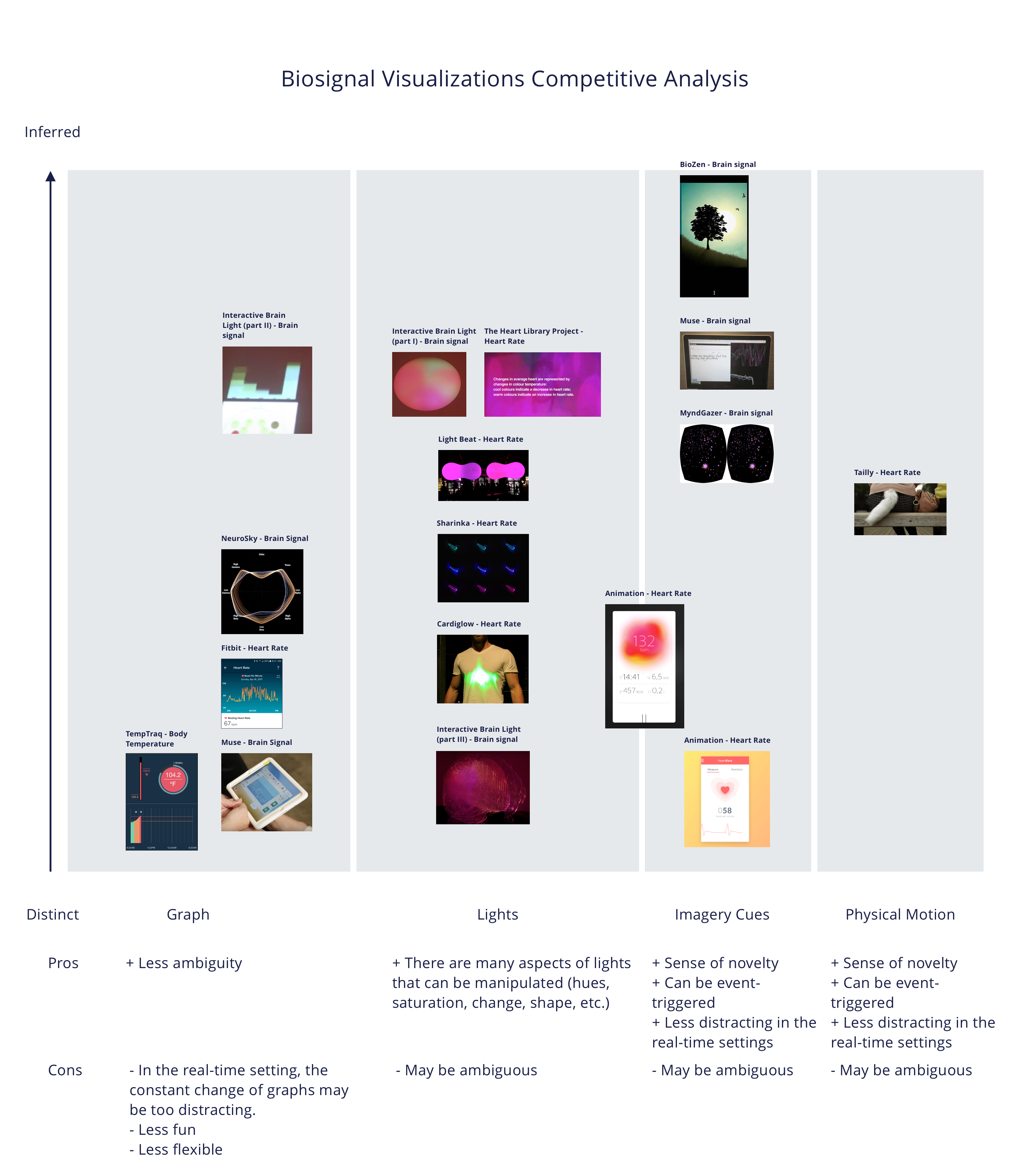
VR
Interaction Design
Affective Computing
Background Research
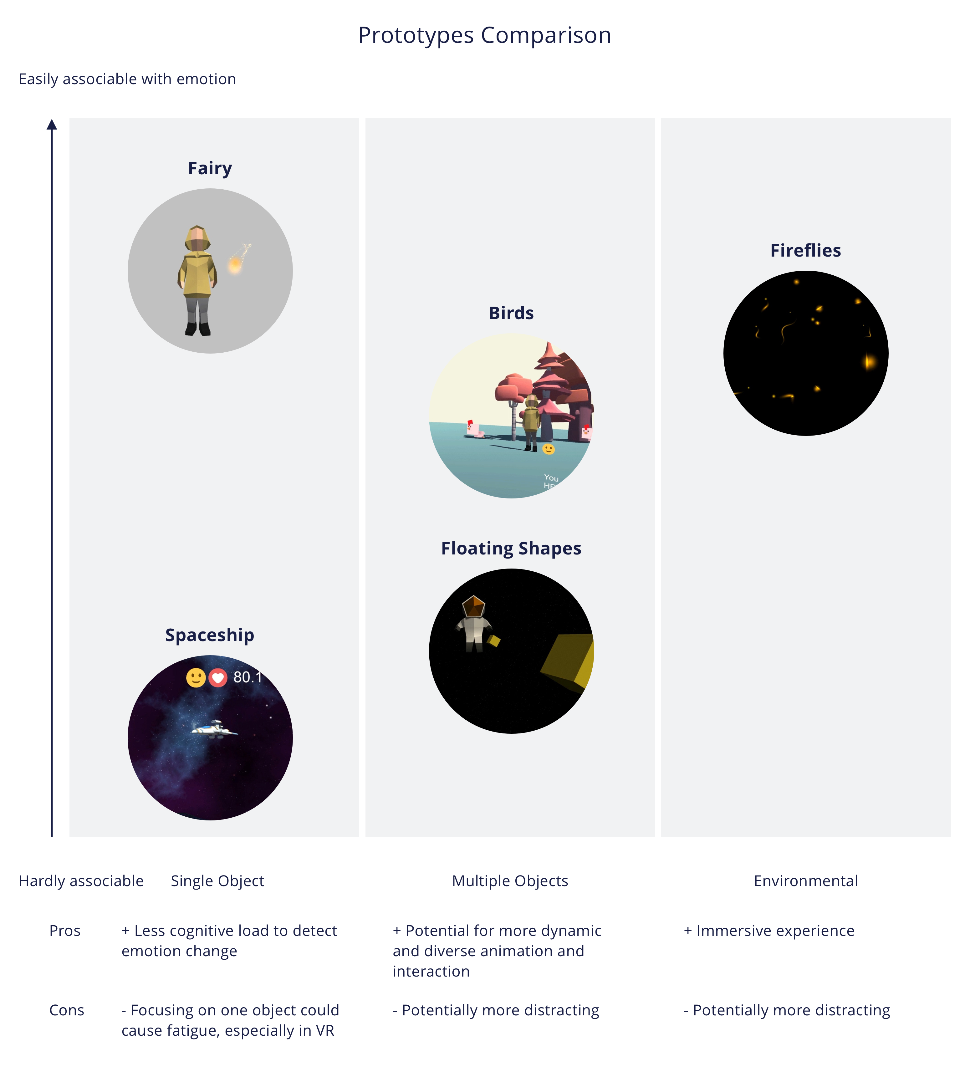
To get inspirations on how to visualize biosignal data, I examined both digital and physical products. I mapped the representation of existing products from the most distinct to the most inferred, and identified four common techniques that are used to visualize biosignal data.
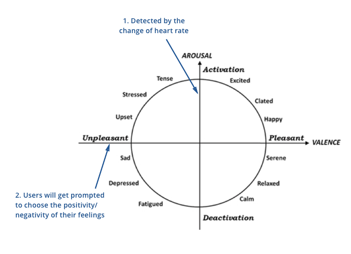
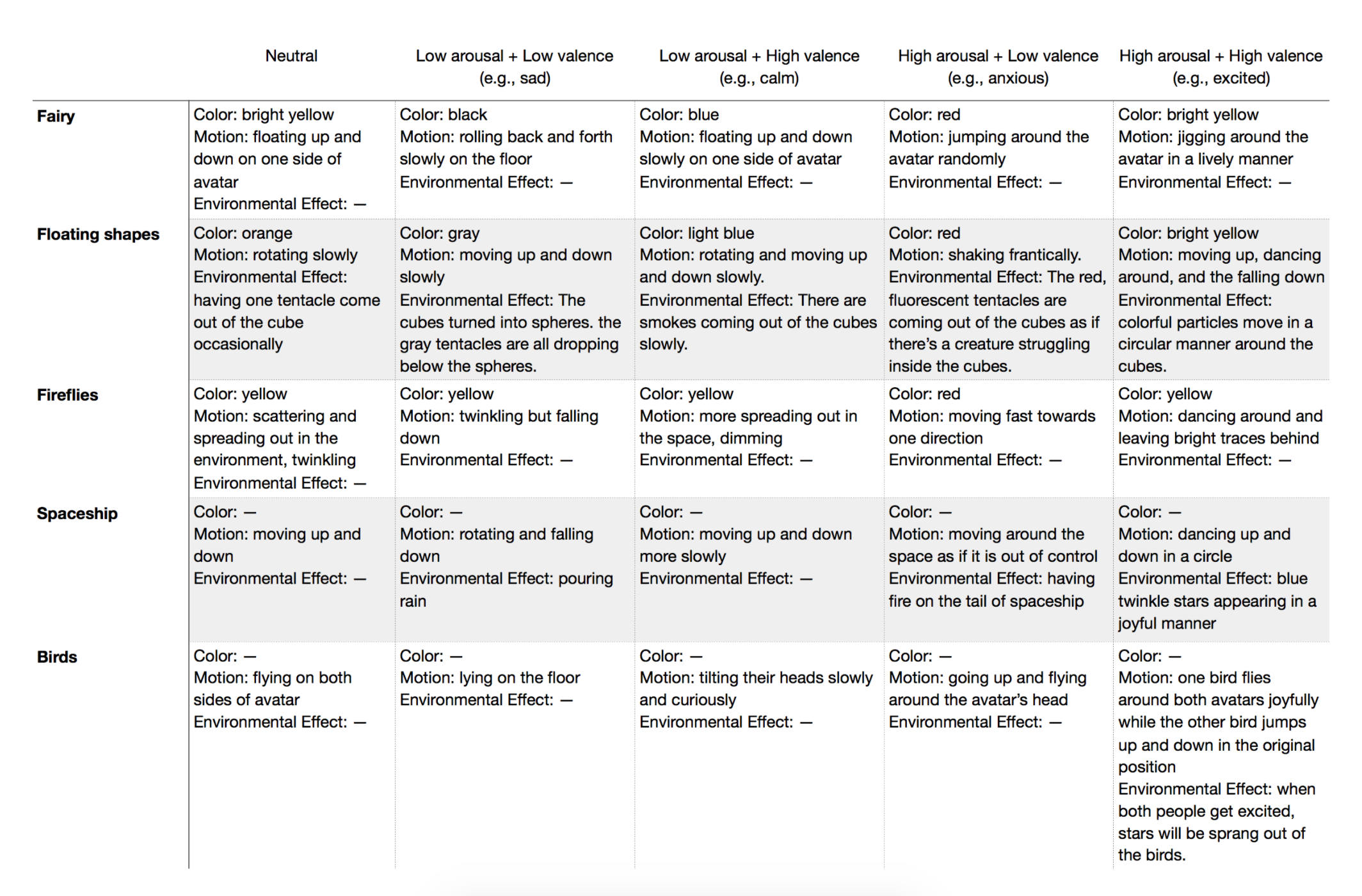
The circumplex model of emotion, developed by the psychologist James Russell, describes how emotions can be distributed in a two-dimensional circular space. In this model, emotional states can be represented by any level of valence and arousal, or at a neutral level of one or both of these factors. Following this model, in each prototype, I designed five different animations to represent four quadrics and the neutral state. In addition, while the arousal will be inferred using biosignal, users will be prompted to choose their valence value, positive or negative, once the change of arousal is detected.
Variety of Representations
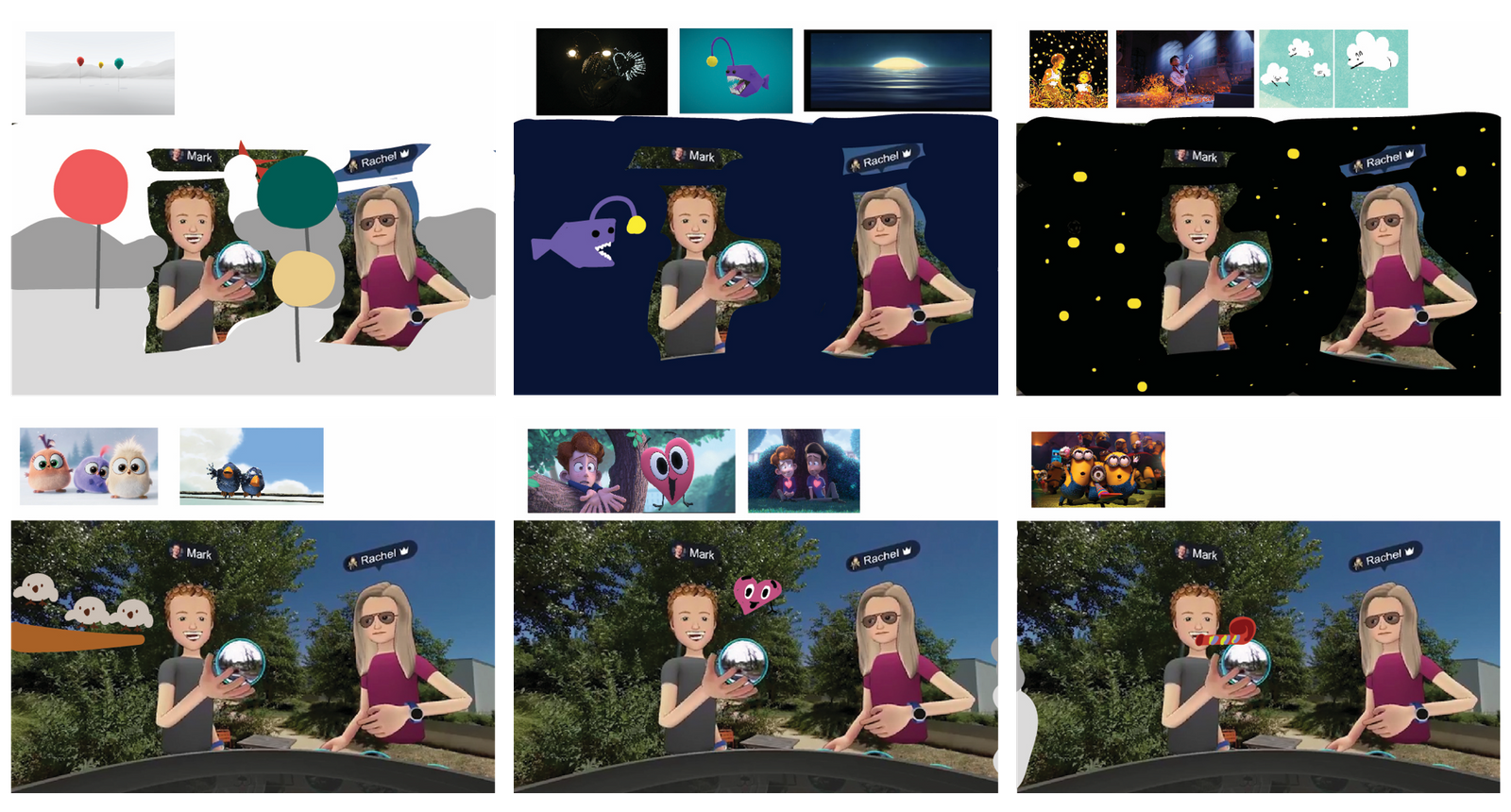
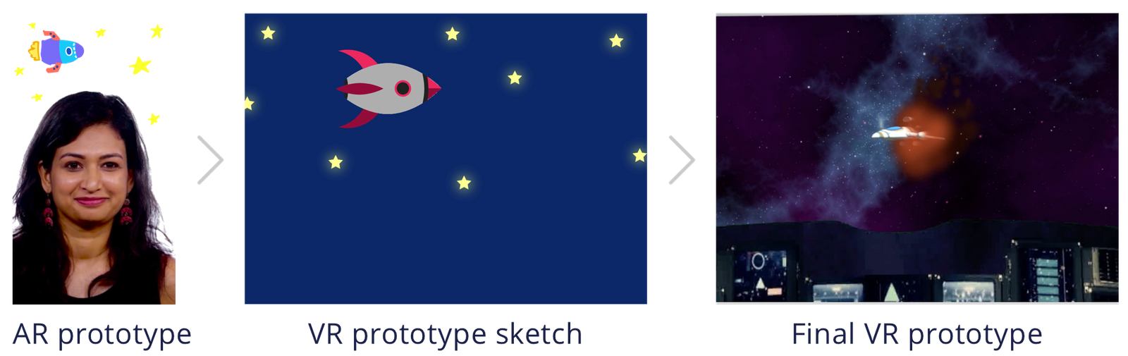
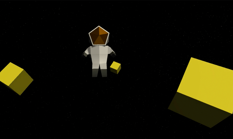
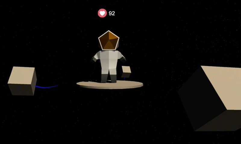
To explore how different representations might influence people’s perception of emotions, I designed and developed five prototypes using Unity.
Emotion Visualization
The table below shows how I have changed these components in different prototypes.
Color
‍
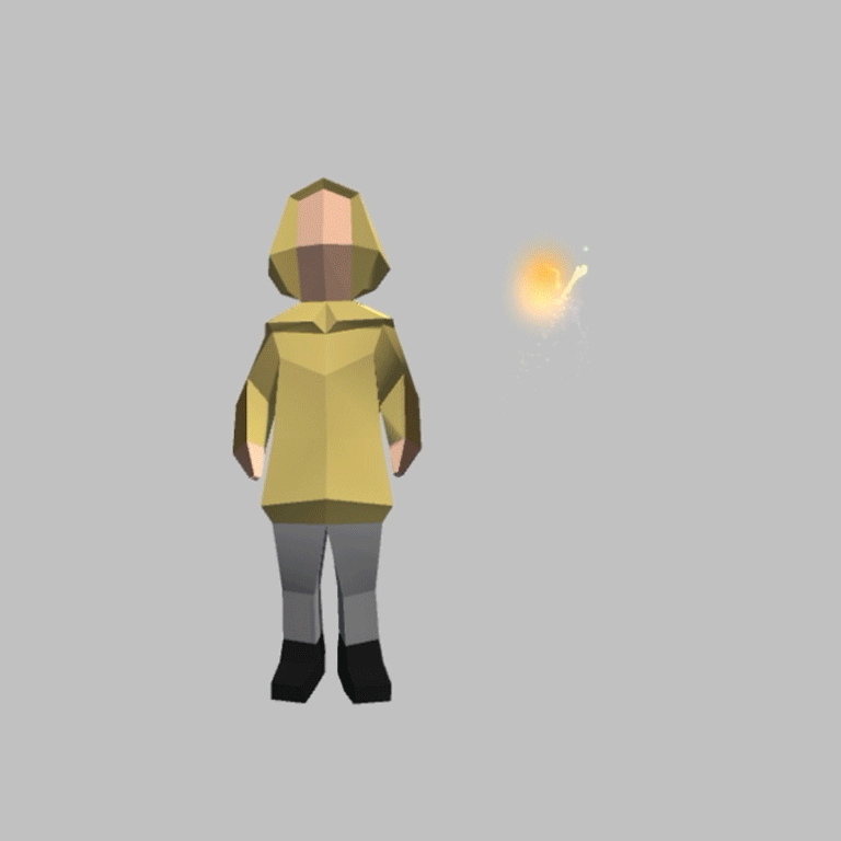
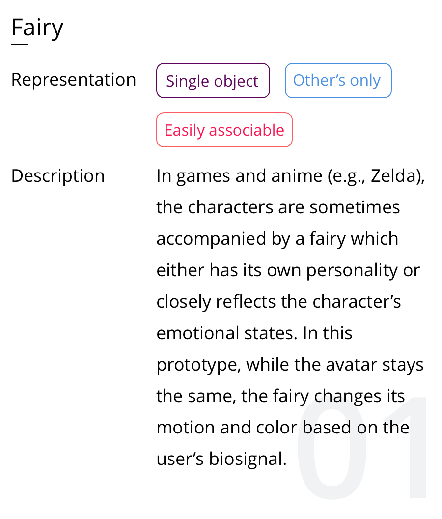
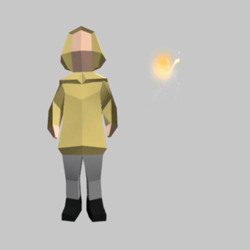
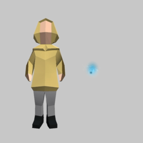
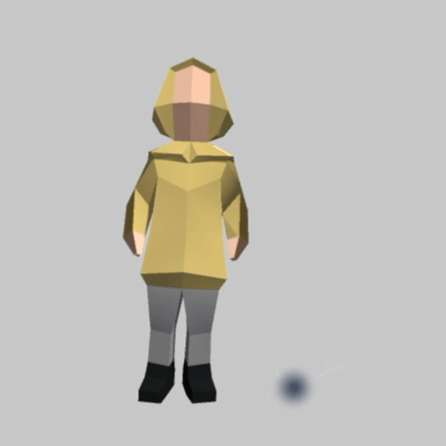
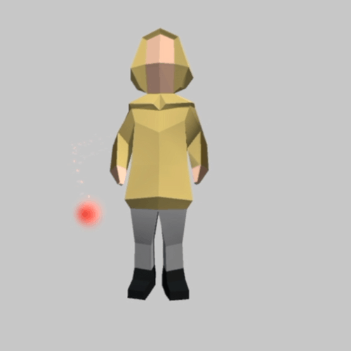
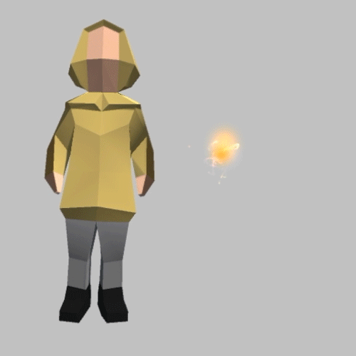
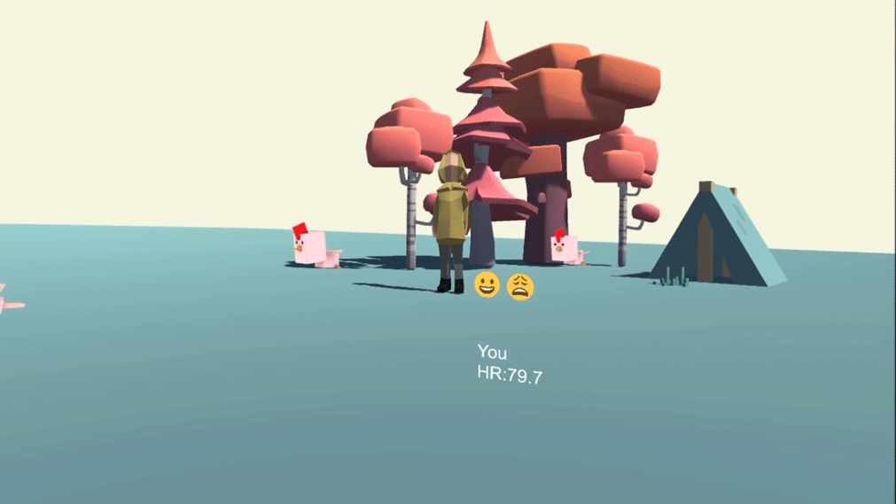
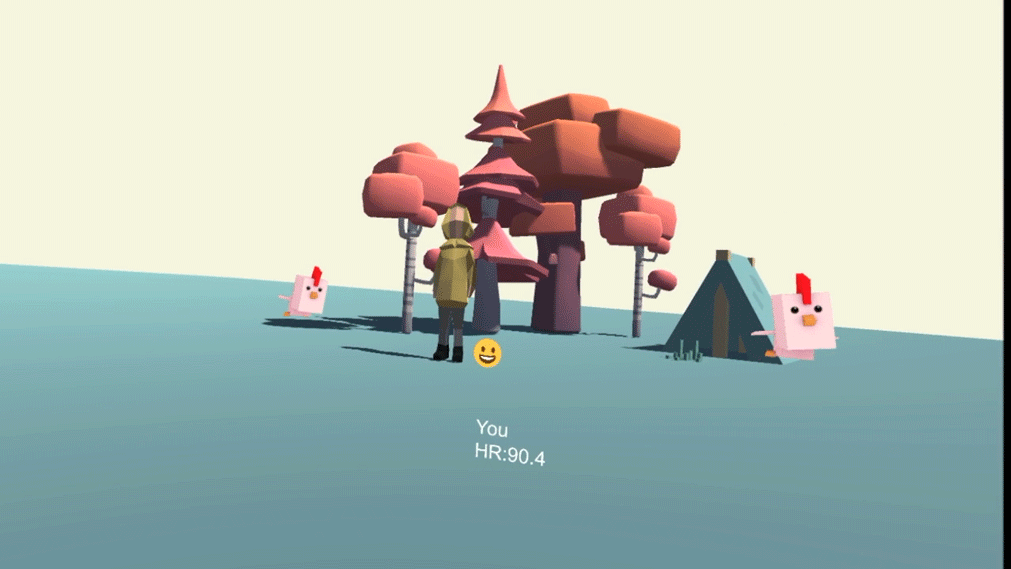
Colors have an established history to be associated with emotions. For instance, in the recent Disney movie, Inside Out, different characters are designed to be in different colors. Joy is yellow. Anger is red. Fear is purple. Inspired by this movie, I adapted different colors to reflect people’s change of emotions in various prototypes. The most representative one is the fairy. When the person feels neutral or excited, the fairy is shown as yellow. When the person feels sad, the fairy becomes black and falls onto the floor. When the person feels anxious, the fairy is shown as red. Lastly, when the person feels calm, the fairy becomes blue.
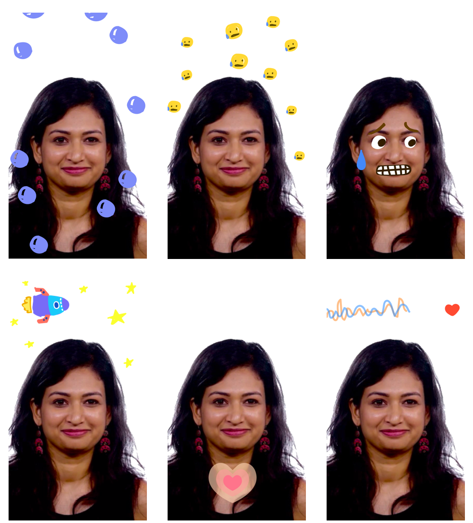
Motion
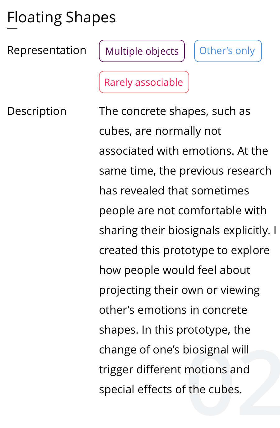
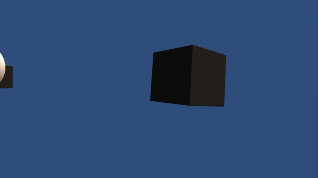
The problem with using colors alone is that while it is extremely useful on abstract representations, changing colors on concrete objects can be confusing. Thus, for the prototypes that contain concrete objects, I focused on using motion to express one’s emotions.
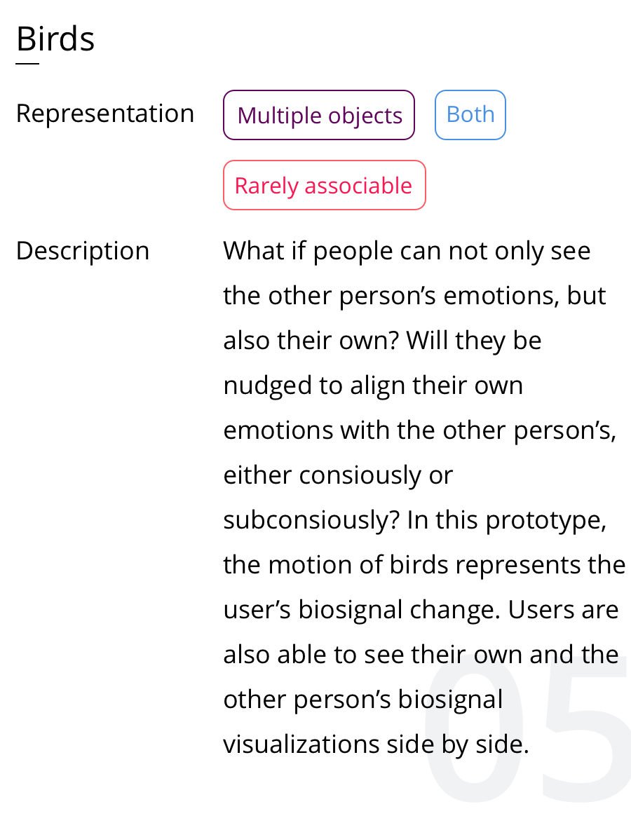
In a neutral state, the birds flies up and down on both side of avatar.
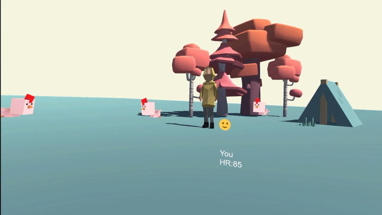
When user gets anxious, the birds will fly around the avatar’s head.
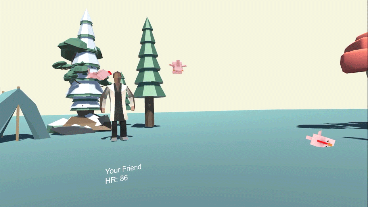
When the user gets sad, the birds drop on the floor, motionless.
When the user becomes excited, one of the birds will fly in a joyful manner and the other will jump around in the original position.
Environmental effect
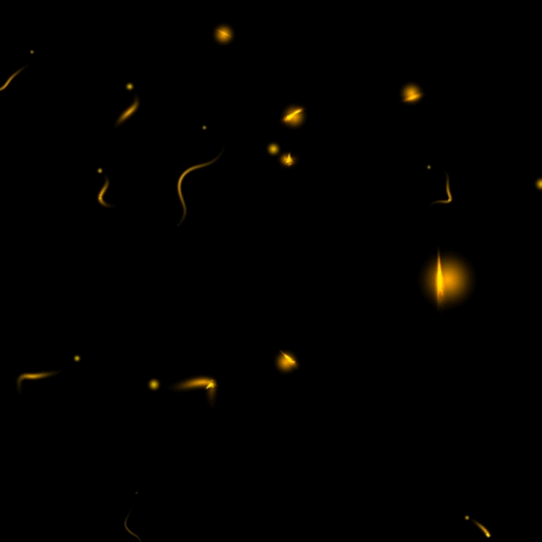
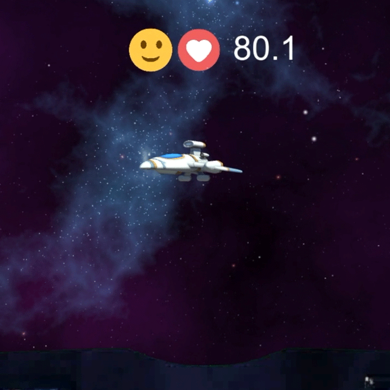
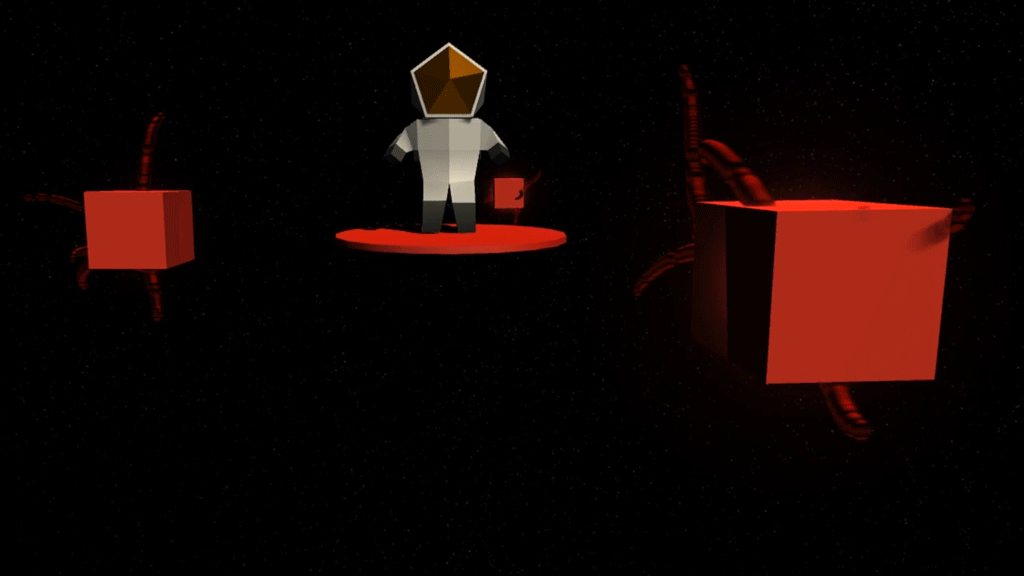
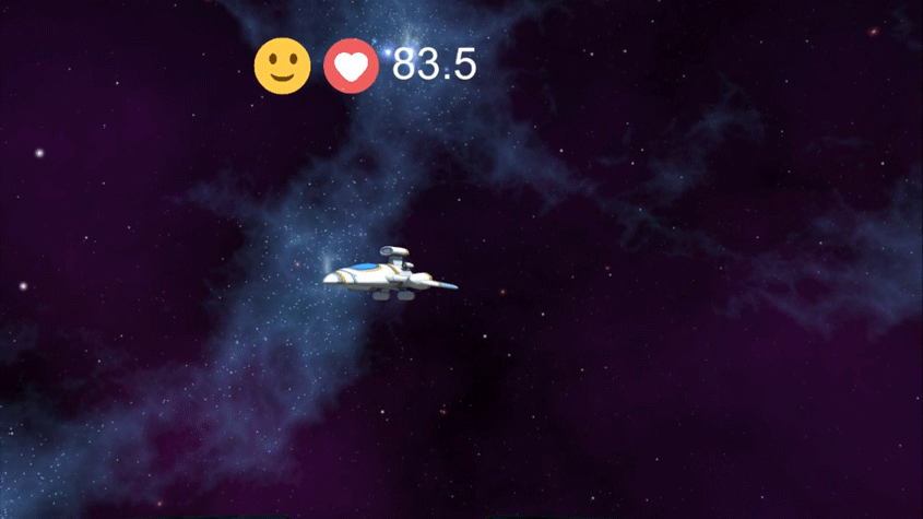
One of the advantages that virtual reality has over the traditional communication platforms is its immersive experience. While both color and motion can be manipulated in the existing communication platforms, the environmental effects that are triggered by special events will provide a delightful and unique experience in virtual reality. By using the environmental effects, I want to enable users not only to see the other person’s emotion, but to feel it and grow empathy and connection with each other.
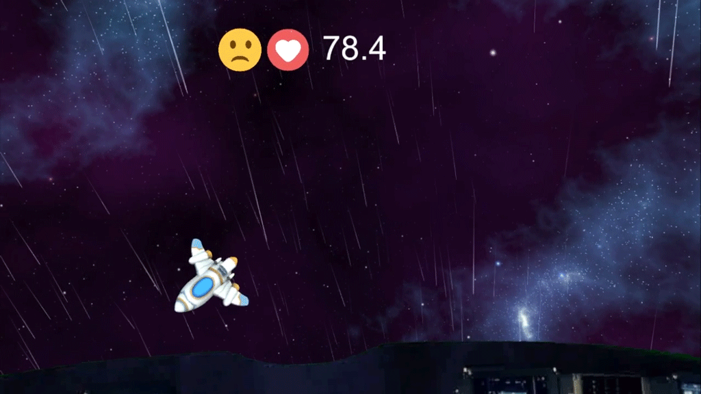
In the spaceship prototype, when the other person gets excited, the user will be surrounded by the blue twinkle stars emerging from the space.
When the other person gets sad, the user will also be soaked in pouring rain.
Design Iterations
Initially, I tried to implement this project in the newly released Facebook AR studio, thinking that it would be a more accessible platform for people to use. I created various prototypes specifically for AR environment.
Two weeks into the project, I realized that there was no way to import biosignal data into Facebook AR studio. Transitioning from AR to VR presented some new design challenges to me. First, since users will be isolated from the real world, I need to add environmental cues for users to understand where they are and potentially what their relationship is with the other avatar. Also, users should feel it is intelligible for themselves, the other avatar and the additional elements for biosignal visualization to co-exist in that space.
When switching from AR to VR, I paid more attention to establish contexts.
The evolution of the spaceship prototype demonstrates how visual cues can help construct a narrative. In the initial AR prototype, the user only sees a spaceship floating on top of the real world. Even though the yellow stars may nudge users to imagine a different context than where they are situated, the stars are still more entertaining than being functional in terms of storytelling. When first moving to VR, I decided to add background so that users know they are being relocated to the outer space. In the final prototype, I further added a dashboard and window tint. Even though these contextual elements are not directly related to emotion expression, having them in the setting creates a backdrop story of why users are where they are and help build the sense of presence and immersion.
The evolution of the spaceship prototype
It is known that many people can get dizzy after being in VR for a while. The user fatigue can be exacerbated if people are required to turn their heads around constantly. Thus, I tried to include all the major visualization elements in people's binocular field of view to reduce their head movement.
In the initial design of floating shapes, cubes were spread out and required users to turn around to see everything. I later reduced the distance between cubes and avatar.
When it is not the avatar that directly expresses emotions, establishing the connection between avatar and the visualization elements becomes very important for viewers to understand the change of emotions and to build empathy. In the floating shapes prototype, without the proper visual cues, users constantly wondered the relationship between the astronaut avatar and the cubes - "are the cubes attacking or protecting the avatar?". To solve this problem, I added a stand for the avatar, that changes color along with the cubes. As a result, users perceived more connection between the avatar and the cubes.
Adding a stand that changes color along with the cubes, as shown on the bottom, made users perceive a closer connection between avatar and biosignal visualization elements.
One thing that stood out to me in the user testing was how much attention people paid to the details. When they were immersed in a new environment, they were so curious and didn't want to miss anything. In the fairy prototype, I have taken a step further beyond its functionality and attached some trails to add more playful personality to the fairy. People indeed noticed the trails and felt really excited about it.
In the beginning, I was laser-focused on how to accurately visualize emotions. However, since the overarching goal is to foster understanding and connection, accurate visualization is not enough. It needs to be inviting even when one person is undergoing negative emotions.
Comparing to the black shaky boxes on the top, the red boxes with tentacles make users feel more welcome to continue their conversation and openly discuss about the visualization.
Evaluating the Design
I tested out the prototypes with people in pairs. They were asked to have a casual conversation for 5 minutes and then switch the roles. Each pair tried out two different prototypes, and they were asked specific questions regarding their perception of the other person, their behavior changes, and their impression of the visualizations afterwards. Here are some interesting insights:
For participants who are not competent in telling other’s emotions in daily lives, they found the visualization extremely helpful in telling how the other person felt.
Participants felt more comfortable with having abstract rather than concrete objects represent their emotions.
Participants enjoyed more immersive prototypes as some of them got fatigued quickly when focusing on or tracking one object for too long.
Sometimes, participants were not aware of how much their heart rates have changed. The change of visualization in that case can lead to the binary reactions: 1) distrust the sensor 2) excited to discover something new about themselves.
For participants who were close to each other, they tended to talk more about change of visualization and each other’s emotion in conversations. However, for participants who were not familiar with other, they responded by changing the conversation topic to avoid contention.
There were still room for miscommunication and misinterpretation. When not openly discussing the change of visualization, people sometimes misattributed the reason why the change happened.
The user testing has revealed several areas for improvements. First, as many has brought up, emotions are dots on a spectrum rather than discrete categories. Ensuring smooth transitions between emotions will provide a more seamless experience and help the other person to respond quickly. Second, although the current prototypes were proved to help friends more openly communicate how they feel, most of the prototypes were hardly successful in bringing people who are not familiar with each other closer. Further testing needs to be done to explore if having both people's biosignal visualization side by side can solve this problem. Another possible solution is to make the visualization more interactive so that people will be encouraged to talk about what they see and why the change happens.
Reflections
Designing for VR is completely different from my past experience of designing for screens. It provides almost infinite possibilities for storytelling and interaction. As a designer, I learned to use the whole space, including background, environmental effects and single objects to construct a novel experience for users. I was mesmerized by this potential of empowering users not only to see things that are invisible in their daily lives, but also to feel them. I'm very excited to work more with the medium of AR/VR in the future.