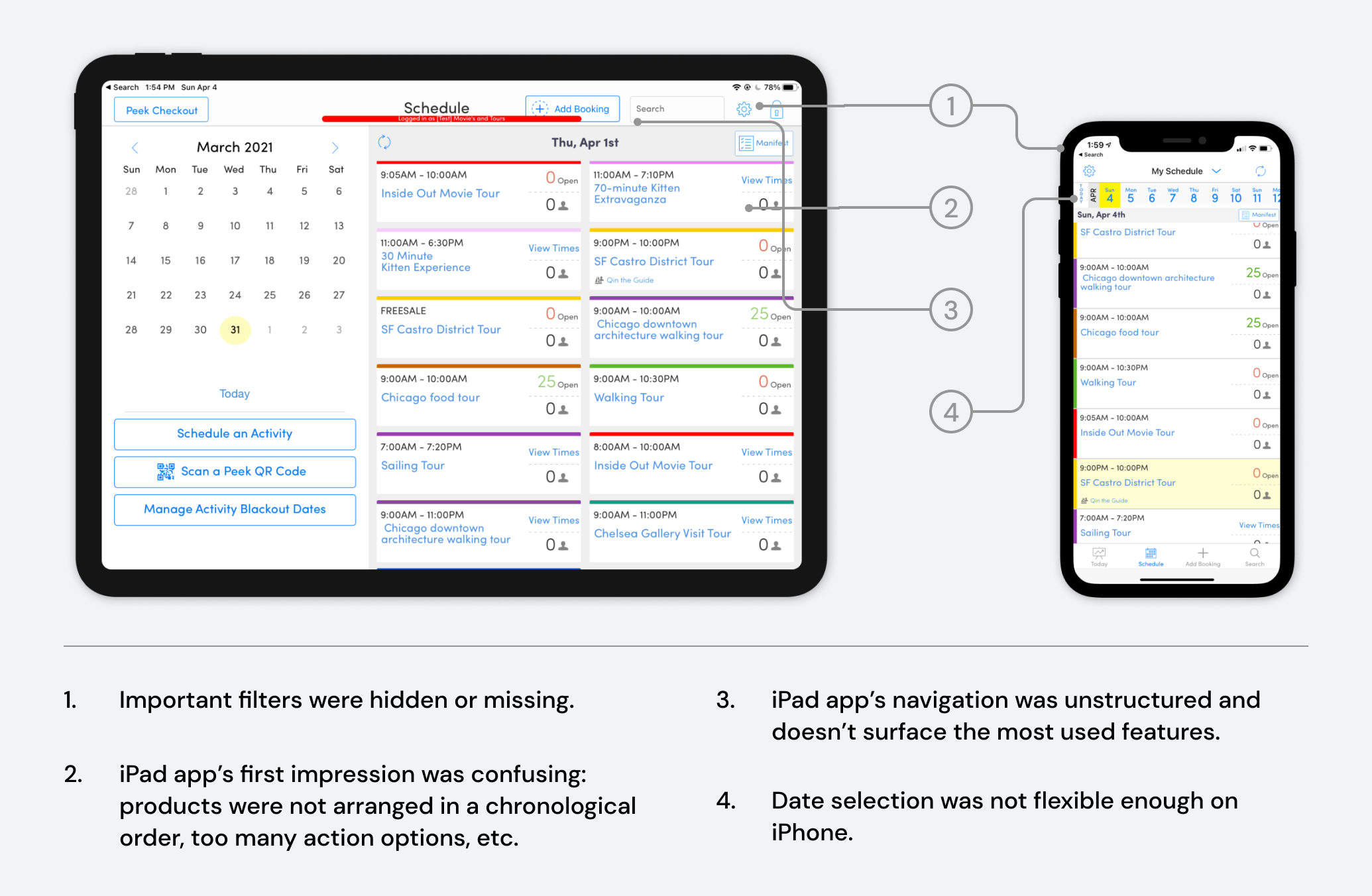
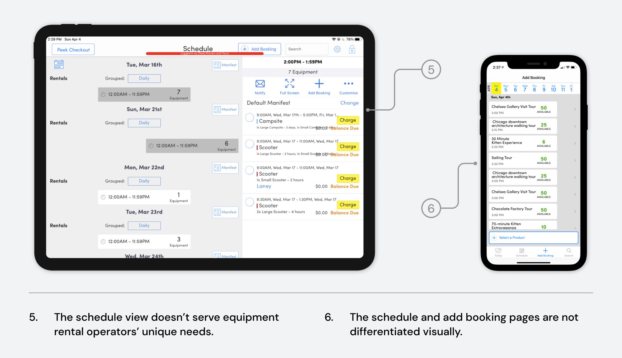
Equipment Rental Reservations Timeline

Product Thinking
‍Interaction Design
Design System

Given an opportunity to identify what Peek Pro app's schedule view can improve on, I created a new timeline experience for equipment rental operators to help them plan for their days, manage resources, and collect lost revenues from overdue reservations.

As the lead designer, I collaborated with 1 product manager, and 2 iOS engineers on this project.

The Context

A collaborative initiative to improve the obsolete schedule view

Schedule view was one of the earliest features built in our app to enable portability. As more and more features were added over years, it has suffered from instability, slow loading speed and confusing UI. This project was a collaborative initiative between design and engineering team to improve the schedule view to make it more usable and valuable for diverse operators.

Design Opportunities

Exploratory research revealed multiple issues.

To discover what issues the current schedule view has, I conducted interviews with both internal team members and operators. As it's also the entry point for our iPad app, I also looked up usage date, JIRA tickets, and sent out a mobile user experience survey to find other optimization opportunities.

The exploratory research revealed multiple problems associated with the schedule view:

Problem Prioritization

Through KANO analysis, I decided to focus on optimizing equipment rental operators' experience.

Given a 3-month timeline of design, we couldn't solve all the problems. Which problem should I tackle first? Based on KANO analysis, improving equipment rental experiences on the schedule view should be our #1 priority.

Success Criteria

Project success is defined by increased NPS, app usage, revenue, and decreased churn rate.

With this redesign, we wanted to:

  • Improve rental operators' satisfaction (NPS)
  • Increase app usage
  • Prevent rental operators from churning to our competitors due to features related to the schedule view
  • Increase revenue gained from overdue bookings

Solution Highlight

Introduce equipment rental reservations timeline

A timeline view with reservations and their status helps operators get a sense of how busy their days will be in a glance. They can quickly update reservations status in this view.

Operators can filter to see a segment of customers and group message them for efficient communication.

When checking back overdue equipment, operators will be prompted to add additional charges to ensure no revenue will be lost.

iPhone app was designed to have feature parity with device specific components.

How we got there

Understand daily tasks of equipment rental operators

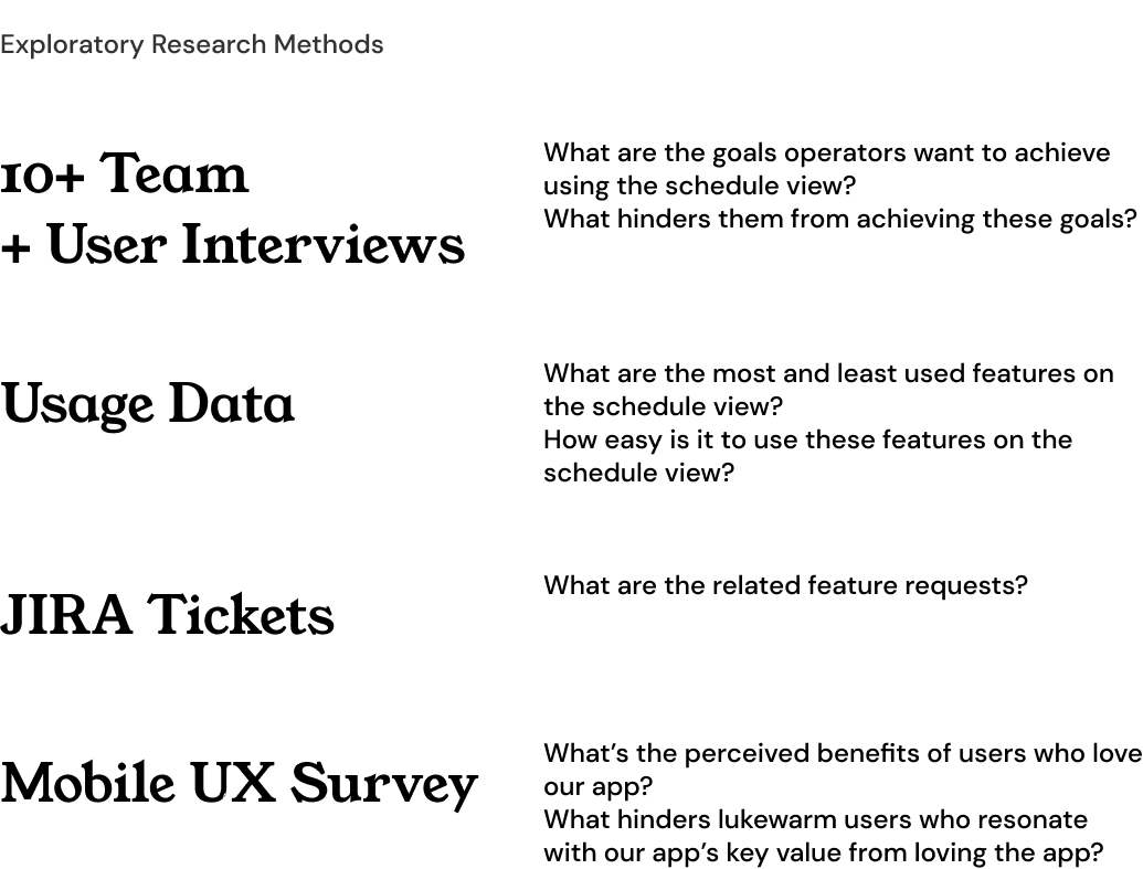
To define what's a better experience for rental operators, we need to first understand what they do from day to day and where our schedule view failed to serve them. From the previous interview notes, I created a visualization of their workflows.

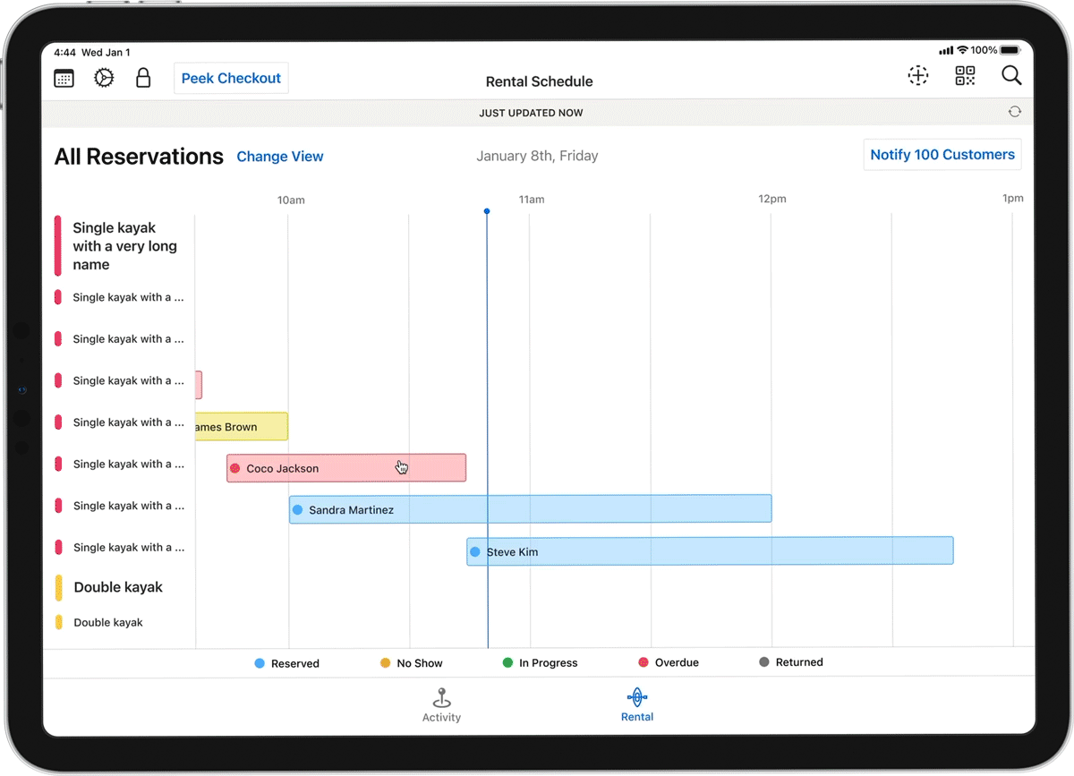
The most significant need that differentiated equipment rental operators from activity ones is that they cared about not only when customers check in, but also when they return. It's crucial for them to know the status of each booking so that they can plan for resource allocation accordingly. Another interesting finding was many rental operators were bad at tracking overdue equipment and saw that as a missed revenue opportunity.

Design Concepts

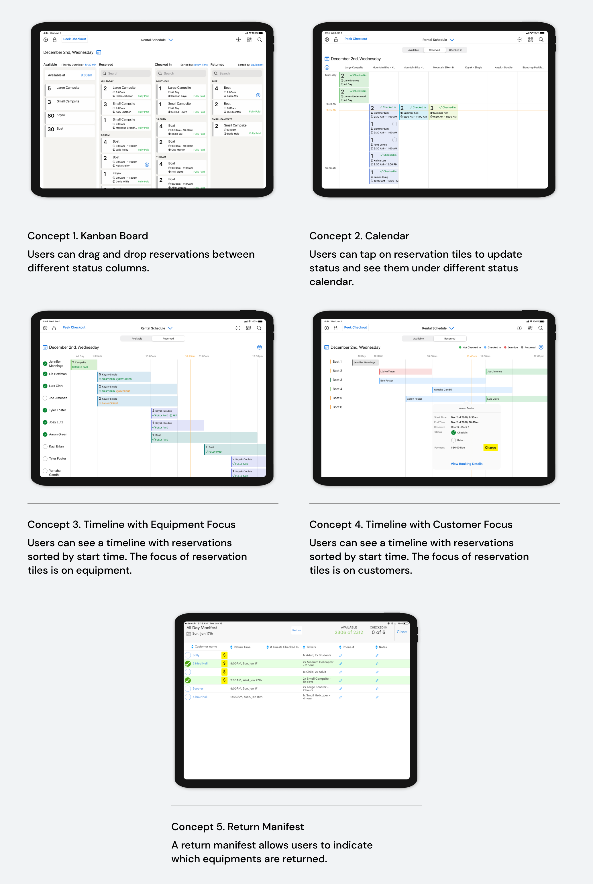
5 design concepts to validate user needs and anchor their feedback

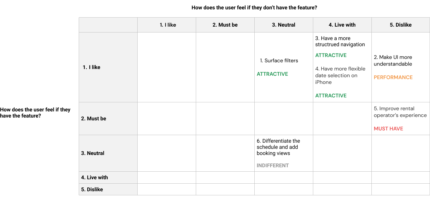
Based on the needs identified, I sketched 5 design concepts. They were used in our user interviews to validate assumptions and anchor discussions.

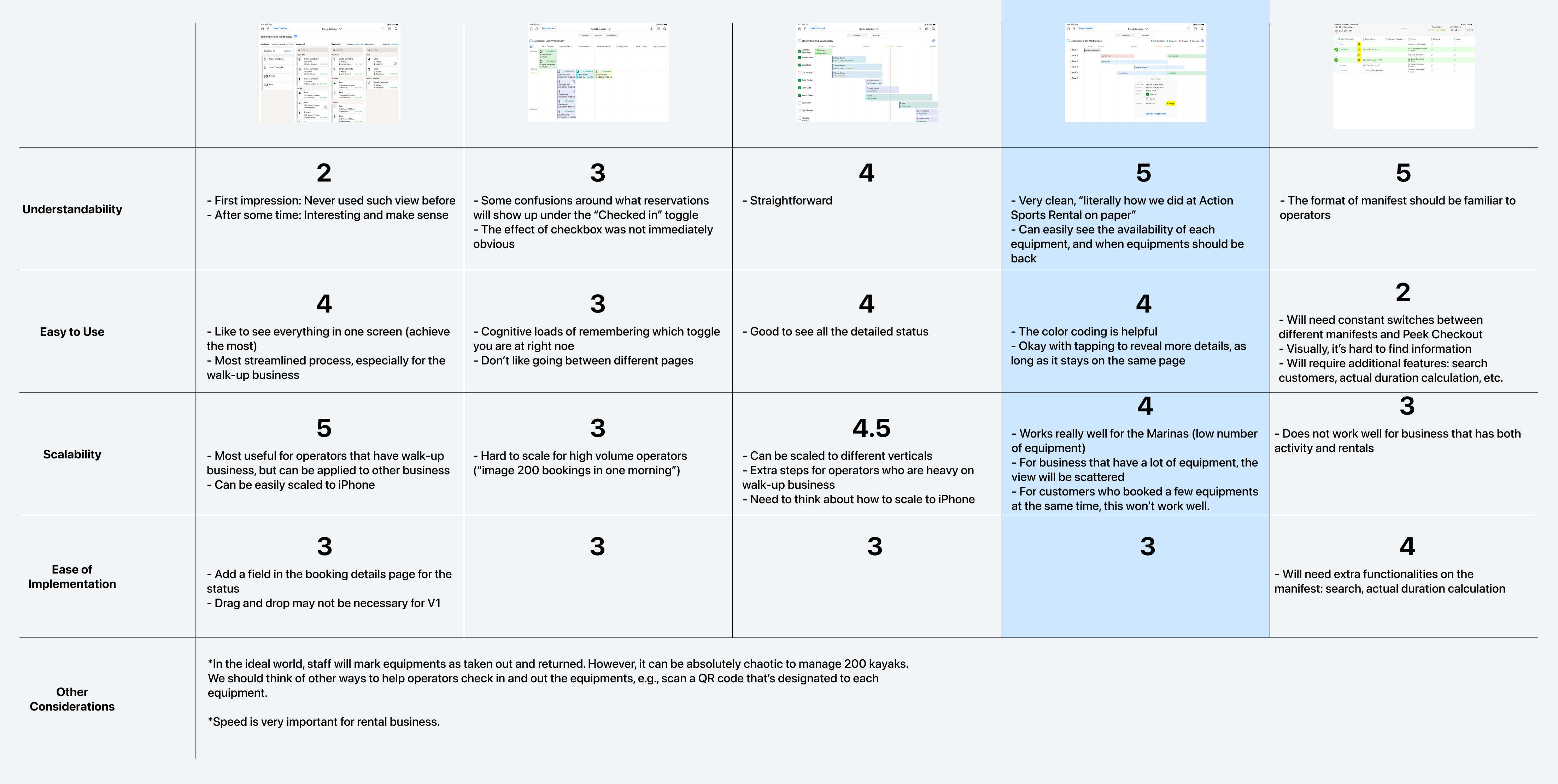
I compiled the feedback into a comparison chart and rated each concept against the following criteria: understandability, ease to use, scalability, and ease of implementation. It was clear that we should go with Concept 4.

Design Iterations

Iterate design to balance between user and engineer needs

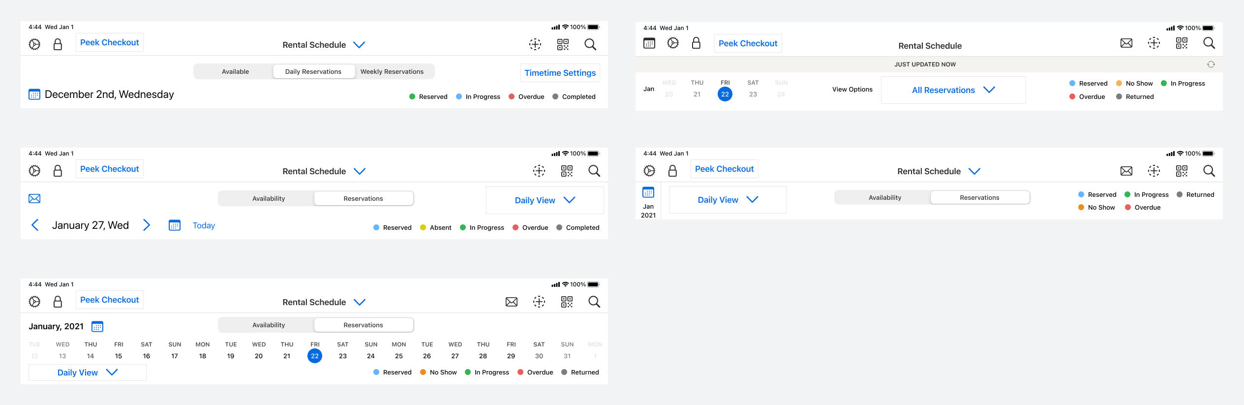
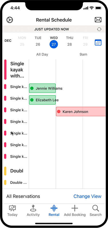
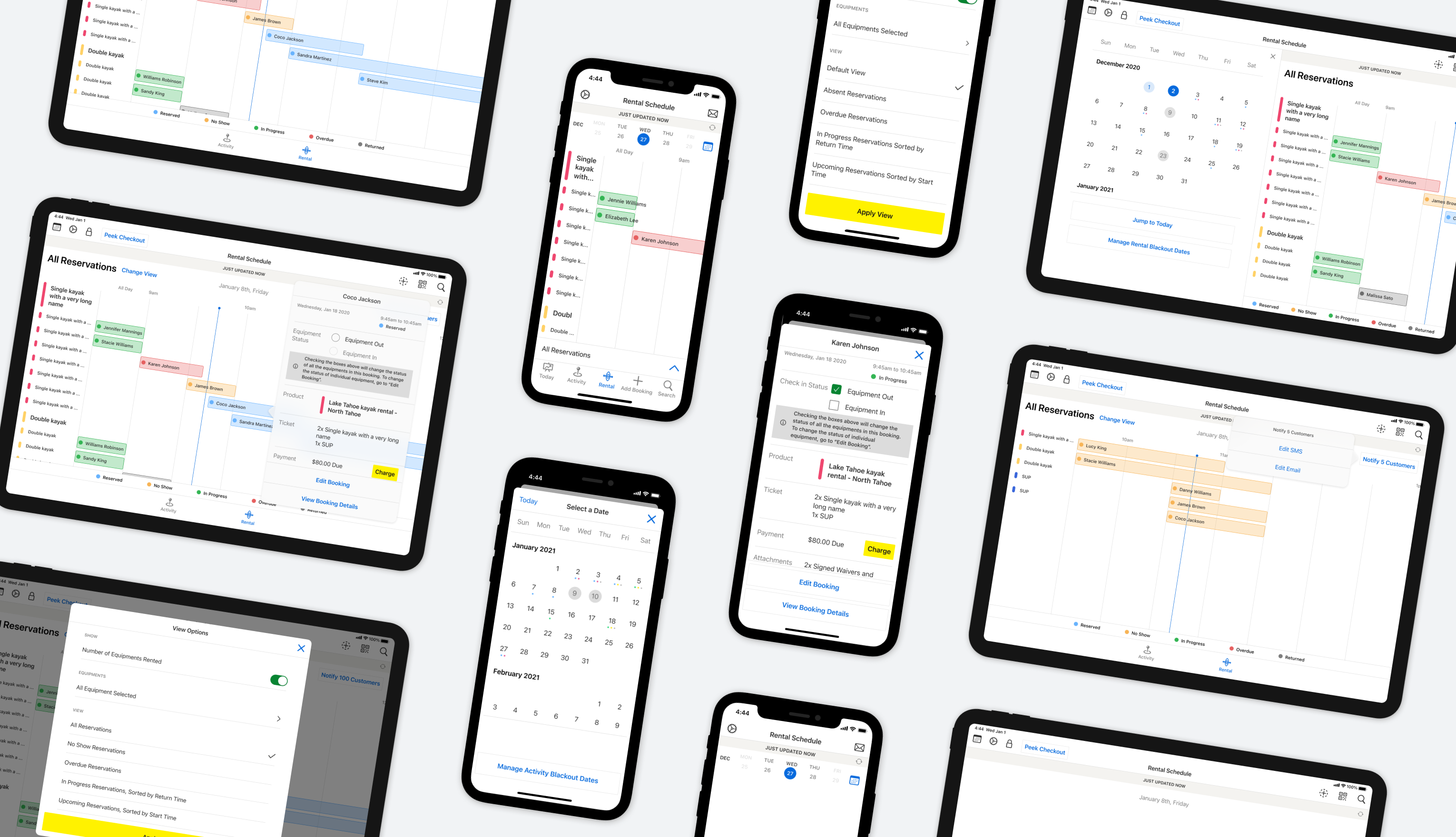
We wanted to make the new schedule view clean and easy to understand while surfacing all the features and providing flexibility of jumping between dates. I explored different versions of the header area to achieve this goal.

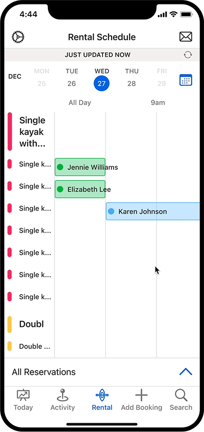
In the end, I decided to minimize the information on the top, and utilize the space at the bottom to show additional information. I also created a bottom navigation bar for switching between activity and rental on iPad and separating these tabs on iPhone after observing how users struggled to find the switch in user testings.

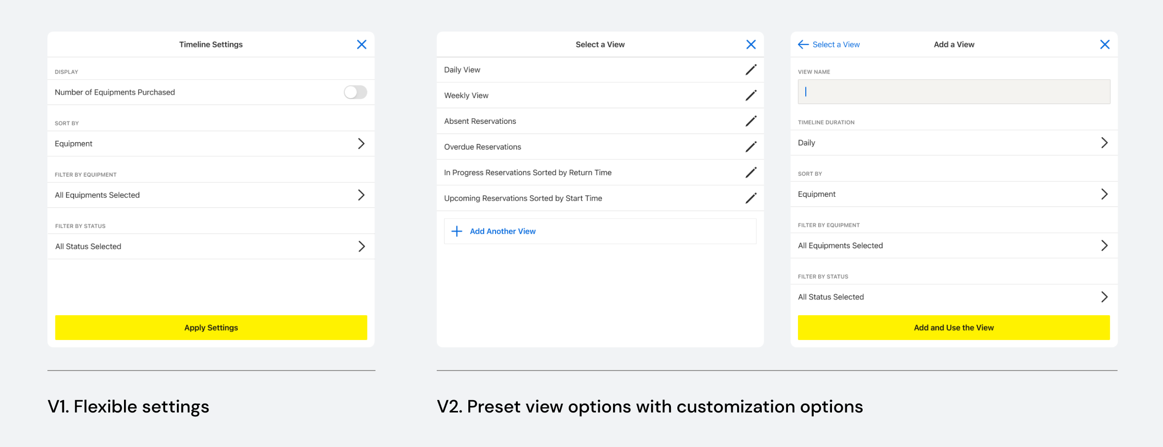
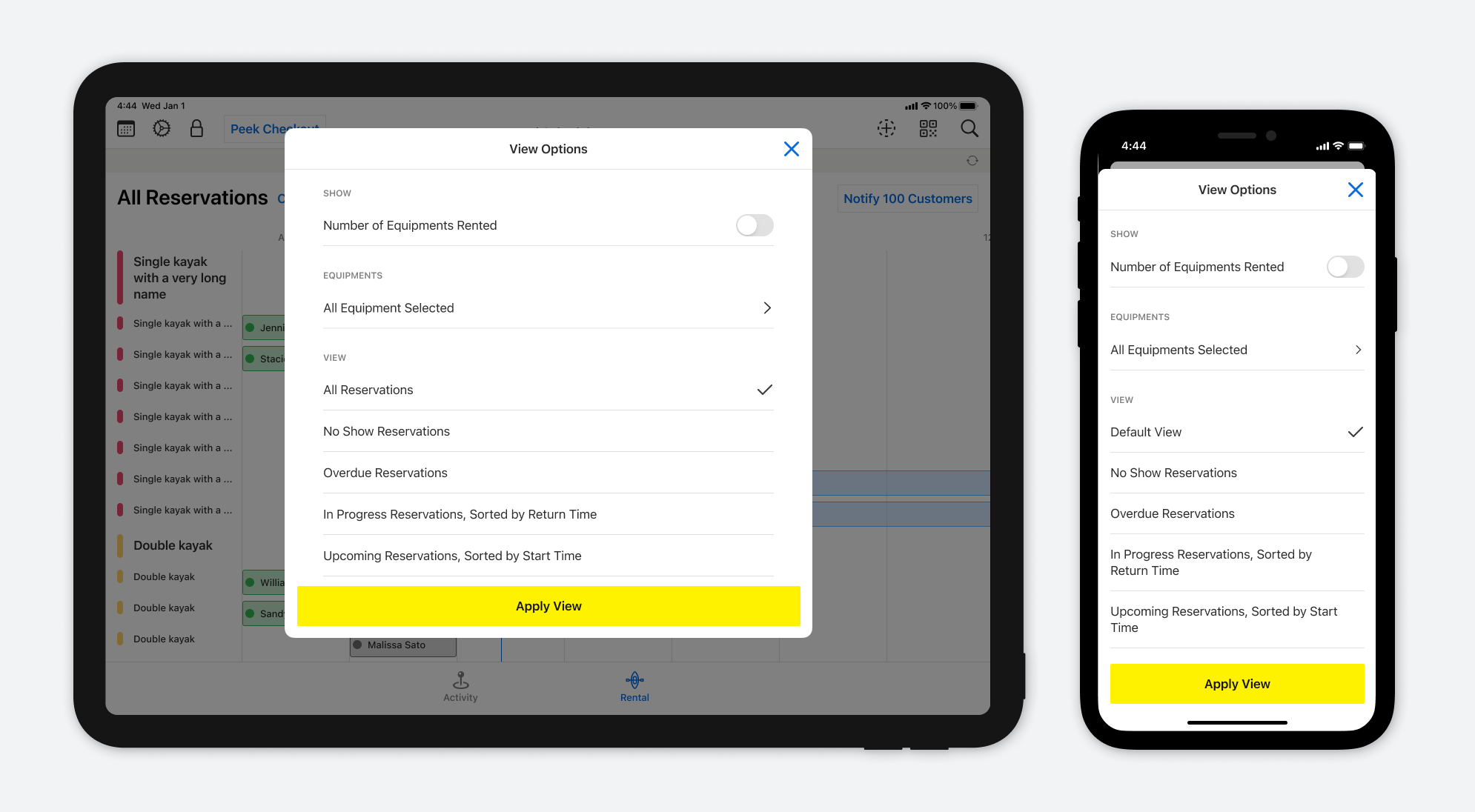
One theme from the usability testing was that operators wanted to customize the views but also to switch between views they often use quickly.

To balance this need and not exploding the engineering scope, I decided to provide preset views that would be commonly used by operators.

Interaction Details

Finesse interaction details and incorporate diverse gestures to scale the experience

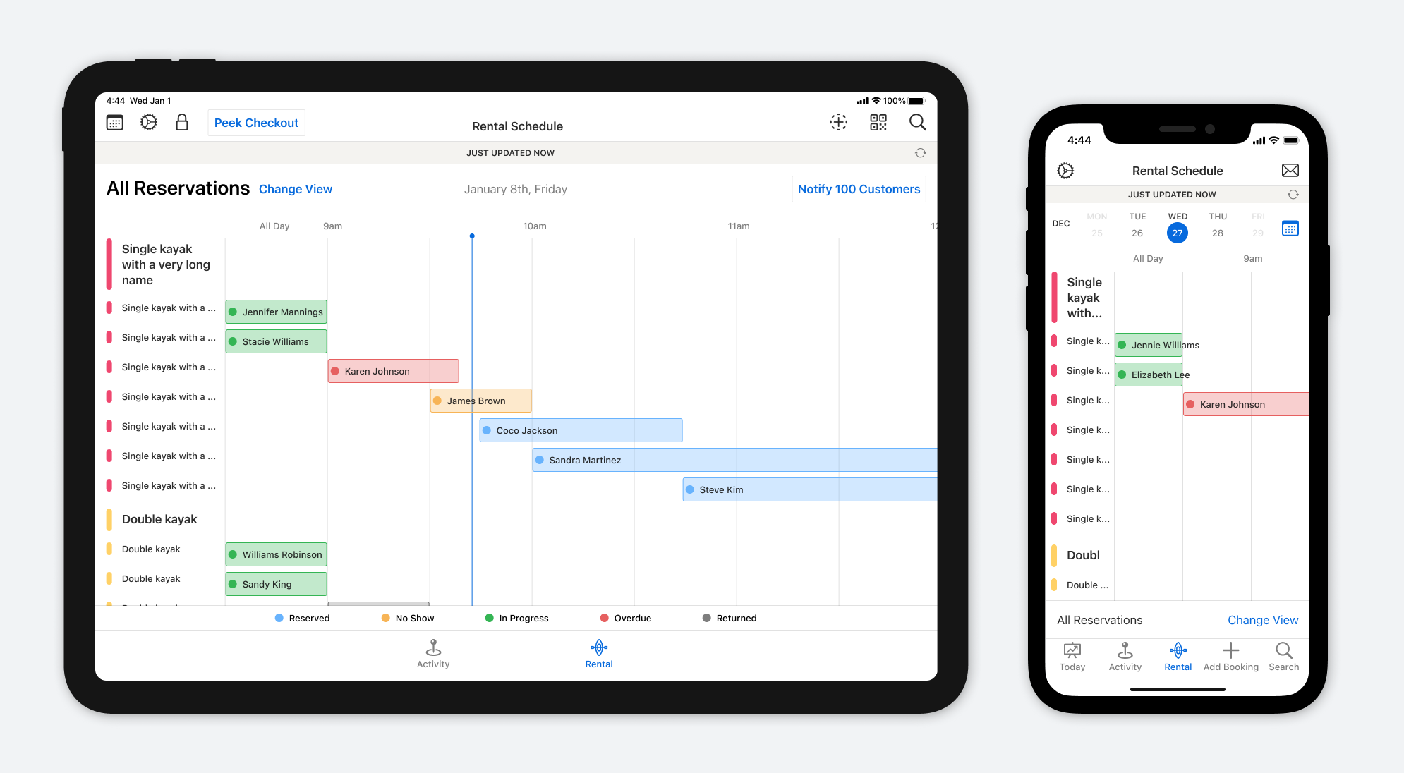
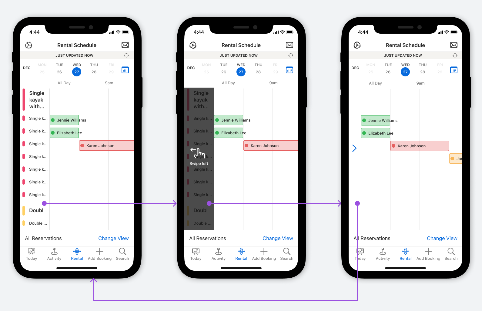
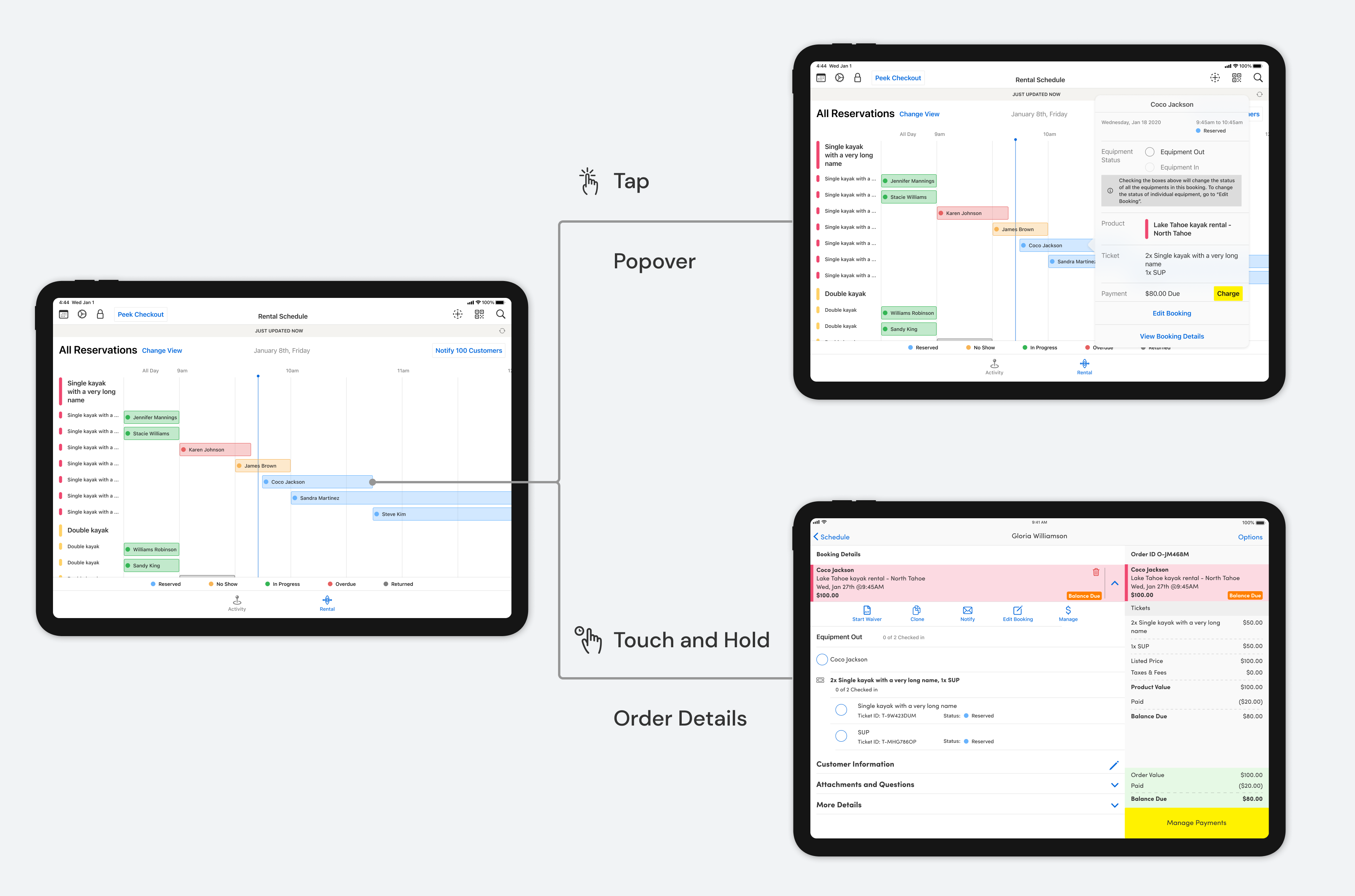
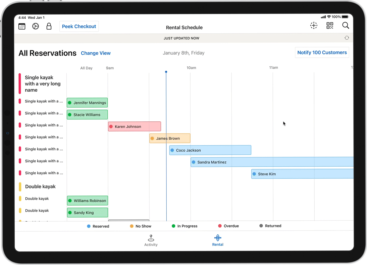
The vertical space for timeline is constrained. To maximize it, I decided to hide the header and bottom bars when users scroll up.

For operators who only have one or two types of equipment, the equipment column on the left will be a waste of space. Thus, to maximize the viewable area, they will be able to hide the left column.

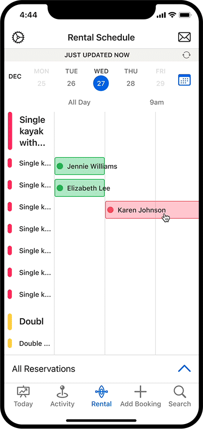
Sometimes operators need more information than the quick pop over to check in or check out equipment. I incorporated different gestures for users to access different modals in this situation. When users tap the "Equipment Out" and "Equipment In" buttons, we will also give haptic feedback on iPhone.
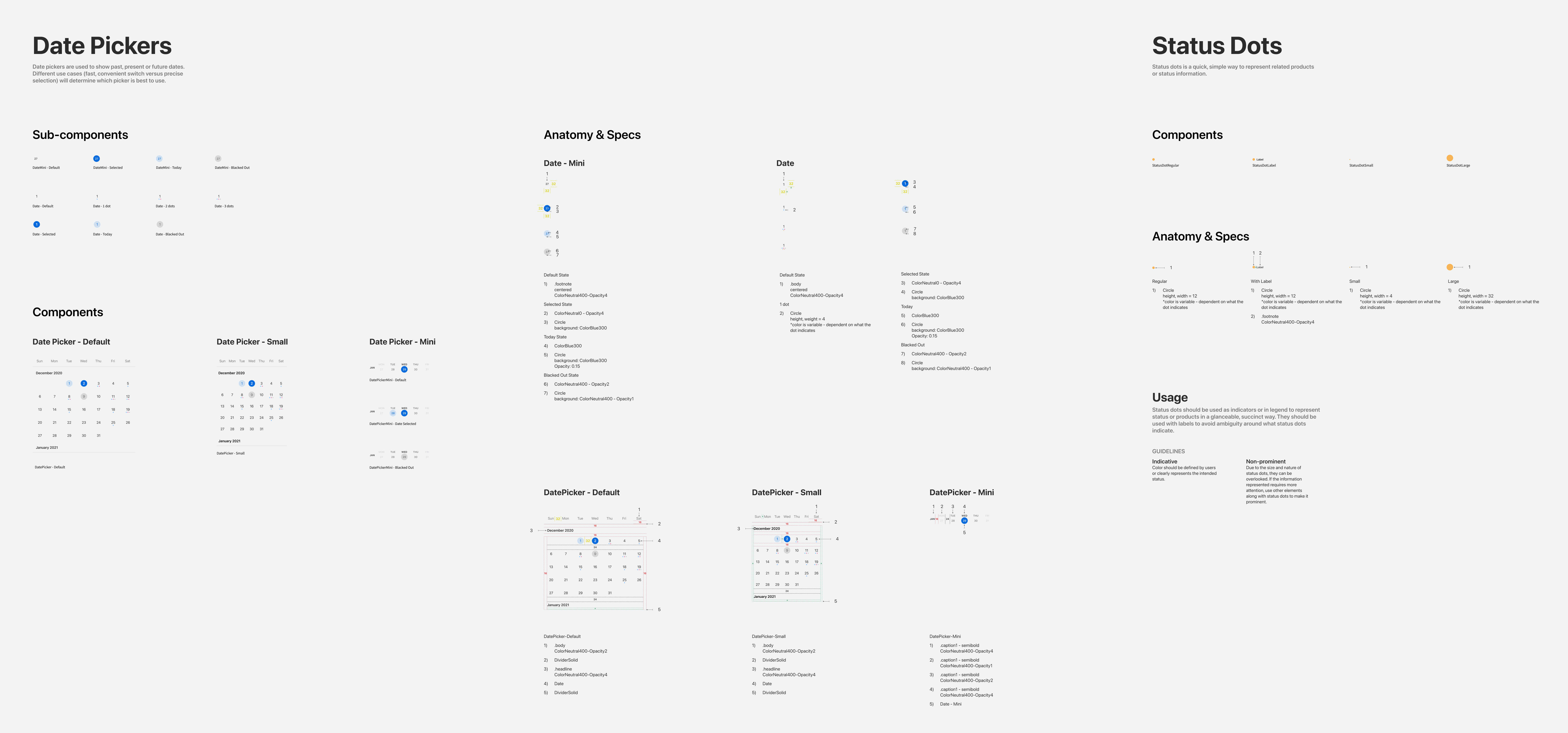
Design System

Standardize reusable components in design system

The new design included a few components that our design system didn't have before. I worked with another designer and engineers to specify and document these components.

Future Improvement

Accommodate variety of use cases and speed up equipment check out/in process

Due to limited engineering resources, we couldn't do everything in this project. Two areas of improvement that will likely have a huge impact on users' workflows were:

  • Optimize the timeline view for different use cases: long-term rentals, rentals that have assignable resources, etc.
  • Minimize frictions in equipment check out/in process. For instance, instead of manually changing status, operators may scan QR codes that are designated to each equipment.

Close the Loop

Gather quantitative and qualitative data to evaluate the design

When I left Peek, the project was under development. To close the loop, we planned to do the following:

  • NPS: send a NPS survey on the schedule view before and after launching the new design, and check if there's a difference
  • Data monitoring: monitor usage data of the rental schedule view
  • User feedback: work with customer success team, and schedule user interviews to collect feedback

Turo Pricing Tools

AR Glasses Concept